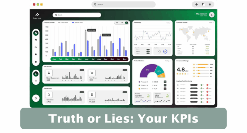
Truth or Lies: Your KPIs
How to Stop Reacting to Noise and Start Responding to What Matters
The question isn’t whether your KPIs lie—it’s whether you can tell the difference.
Picture your last leadership team meeting. Someone presents the monthly performance dashboard. Customer complaints are up from last month. Staff turnover dropped compared to last year but missed the target. On-time service delivery improved, but the year-to-date figure tells a different story.
The debate begins. What’s really happening? Should we act? If so, on what? An hour later, you’ve assigned action items, but a nagging uncertainty remains: are we fixing real problems or just chasing shadows?
Here’s an uncomfortable truth: most organizations spend enormous energy reacting to (& explaining) changes that actually mean nothing while missing the signals that matter most.
The Two Mistakes That Waste Your Time
Without realizing it, leadership teams make two costly mistakes when interpreting organizational performance data:
Mistake #1: Overreacting to noise. We treat normal fluctuation as though something significant happened. When this month’s no-show rate ticks up, someone must explain why. When customer satisfaction dips below target, we launch an initiative. But if these variations are simply the natural “bounce” in the system—the background noise inherent in any measure—our reactions accomplish nothing. Worse, constant tinkering often makes performance less stable over time.
Mistake #2: Underreacting to real change. Likewise, we miss genuine shifts in performance because we’re so focused on comparing this month to last month, or to a target, or to the same period last year. A meaningful improvement begins, but we don’t recognize it soon enough to understand what caused it. A troubling decline starts, but we don’t detect it until it has reached a crisis level.
Both mistakes have the same root cause: we’re making decisions based on limited comparisons that ignore the broader context of our organization’s performance over time.
What Changes When You Can See Clearly
Imagine a different leadership meeting. The same dashboard appears, but this time, each KPI tells a clear story. For three measures, the data shows only routine variation—the normal ups and downs of a stable process. The team agrees: no action needed, and the conversation moves on in seconds.
But two measures show unmistakable signals of real change. One reveals that client satisfaction shifted to a new, higher level four months ago—right when you implemented the new intake process. The improvement is genuine and notable. The team shifts from debating whether it worked to discussing how to spread this success to other departments.
Another measure shows hospital readmissions with a short run signal—a clear shift indicating factors in the underlying system have changed. It’s still within acceptable bounds, but the pattern is unmistakable. Rather than waiting for a crisis to emerge, the team proactively investigates root causes.
The entire meeting dynamic has changed. Less debate about what the data means. More focus on understanding why performance changed and what to do about it. Faster decisions. Better use of everyone’s time and expertise.
This is what becomes possible with Smart Charts—a name my PuMP colleague Stacey Barr coined for these powerful charts. Smart Charts help you and your team more effectively interpret organizational performance. All leading to greater clarity on where to focus your strategic improvement efforts.
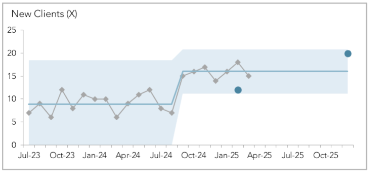
Source: Using Smart Charts (by Stacey Barr, PuMP Academy)
The Power of Seeing Patterns, Not Just Points
Smart Charts work by showing your KPI’s values over time along with two calculated additions: a central line representing your current performance level, and a shaded zone showing the range of normal variation you can expect if nothing changes.
When you view performance this way, signals become obvious. You can instantly see:
- Whether performance is truly changing or just bouncing naturally
- When a change began and how large it is
- Which KPIs urgently need attention and which are performing predictably
- The actual impact of your improvement initiatives
The technical name for these charts is “XmR charts,” and they’ve been fundamental to quality management in manufacturing, healthcare, and countless other fields. But they remain surprisingly underutilized in organizational performance measurement—which means most leadership teams are still reacting.
An Invitation to See Differently
You don’t need to become a statistician or a “numbers person” to benefit from Smart Charts. You simply need to shift the way you view and discuss organizational performance data: from comparing individual data points to observing patterns over time—from asking “what happened this month?” to asking “what is the system telling us?”
The implications are profound. When you can reliably distinguish signals from noise:
- Your meetings focus on the right priorities
- Your improvement initiatives can be tested and proven
- Your team spends less time explaining and more time improving
- You catch problems early, when they’re still manageable
- You recognize successes and understand what caused them
As Donald Wheeler, the modern-day expert on XmR charts, reminds us: “While it is simple and easy to compare one number with another number, such comparisons are limited and weak.”
The question isn’t whether your organization will eventually embrace this way of seeing performance. The question is: how much longer can you afford to make decisions based on incomplete information or inconsistent interpretations?
Your KPIs have stories to tell. Are you ready to hear them?
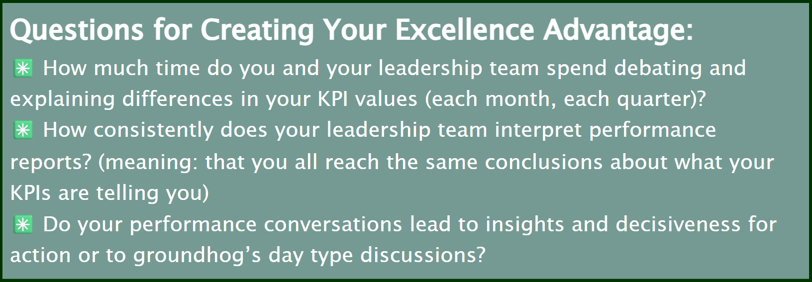
If you’d like to receive these Inspirations in your inbox every other week, you can subscribe to Kathy’s Excellence Advantage Inspirations Newsletter.
Kathy Letendre, President and Founder of Letendre & Associates, advises organizations and leaders to create their excellence advantage.
Contact Kathy by phone or text at 802-779-4315 or via email.